Thursday, 3 October 2013

Tate Modern Collections Review

02/08/13-author's own
On the fourth floor of the Tate Modern there is a room in the Energy and Process collection dedicated to the Arte Povera and Anti-form movement of the 1960’s. Curated by Mark Godfrey and Helen Sainsbury, it includes pieces from Giovanni Anselmo to Richard Tuttle. Despite no two pieces in the collection originating from the same artist, the room still has a cohesive quality due to the signature focus on the process of making rather than finished piece that defined this movement. Spearheaded by the Italians, Arte Povera embodied the art of the everyday and explored ideas of energy by using a diverse range of materials, from industrial to organic.

'From Surface to Surface' - Sisumu Koshimizu-02/08/13
author's own
They often worked with malleable and volatile substances which allowed natural forces and energies, such as gravity, electricity, and magnetism to manifest themselves in the work. The making process is evident in the final piece, such as with Sisumu Koshimizu’s work ‘From Surface to Surface’ which takes up an entire wall as you enter. Koshimizu sought to understand the world as it is by exploring the essential properties of materials, not changing them. In this piece he effectively investigates the substance of the wood by cutting into, sawing, and exposing various surfaces. About this, Kurban Haji (chair of the Southwark art forum) said ‘I can almost smell this piece...it gives me a sense of all the potential in the objects you encounter everyday.’ ('The Bigger Picture'-Kurban Haji) The impact on the viewer is an important concept in Arte Povera, and so in each piece of work you can feel the artists projection onto the viewer, giving the exhibition a more personal feel.
'Felt' - Robert Morris-02/08/13-author's own 

The ideas of anti-form and Arte Povera were quite radical in their time and have been criticised for its lack of political interest and step away from technological modernism of its time. Instead it concerns itself with physical states and is very untraditional in the way the art is displayed and distributed. Robert Morris’ Felt work, originally made 1967, is a perfect example of this. Morris, in his work and essay on ‘Anti-Form,’ questioned and rejected the fixed geometric shapes and imposing of order on their work of the minimalists. Instead he let materials determine their own shape, relinquishing control of their final appearance. This means the work is different, and even has to be remade, each time it is displayed. The overall exhibition creates and unusual and eclectic collection that catches the eye questions many traditional views of art. Christine Cook, head of family and community programme at the Tate Modern, feels the pieces are ‘getting rid of the idea most of us had, that art has some kind of inaccessible secret to it.’('The Bigger Picture' - Christine Cook).

Bibliography:
http://www.tate.org.uk/search/energy%20and%20process%20arte%20povera%20and%20anti-form
'The Bigger Pictures' - Kurban Haji- Text in Gallery
'The Bigger Picture' - Christine Cook - Text in Gallery
Text by Mark Godfey
-all 03/10/13

Tuesday, 1 October 2013

Fashion and Textiles Day 3:

Making and Modelling:

After the Fashion Illustrating the day before we started to think about creating a piece or garment that focused on one area of the body. Again working entirely with paper we did loads of quick designs and ideas (coming up with about 40 in a few hours). I decided to focus on shoulder pieces, concentrating on sharp angular structures that would exaggerate the shape of the body. In the end I chose a simple design that had the biggest connection to my starting point, looking at structures. Working with rolled up black card and a lot of sellotape I made a triangular structure that fitted round the shoulders using wire. I was told the end result looks like a wing extending from the body although this was an unintentional though welcome effect as I was focused on asymmetrical shaping and even allusions to armour around the shoulder and upper arm. After finishing our products we were told to photograph them on different levels around the school, thinking about the styling and interactions with surroundings (though told to use only natural lighting). In a similar way to illustrating we were thinking about the impression and mood of the piece we wanted to convey. I modelled the piece myself (as for simplicities sake had made it to fit so as to save worrying about measurements in our limited making time) and Rosie Allen (a classmate) helped me by taking the photos and advising on camera angles and postures. Here are the results:


 The photos above I really liked as something about the positioning of the windows in a small room meant that the natural lighting gave a very nice effect on the photos, giving an almost eerie impression and that and the lines of the curtain behind created an interesting composition.


Monday, 30 September 2013

Fashion and Textiles Day Two:

Fashion Illustration: 

Working with images selected from magazines we were told to create illustrations, in some place using our samples from the day before as a starting point for inspiration. The illustrations should be 3D and work around the figures to create an impression of a garment or structure on the body:


1

2
3
5
4


6
7


These are some pictures from my classmates that I admired.  The 3D work is very effective and I like the way they both work outside the form. The first image with its complete obscuring of the clothing and body, creates an imaginative and suggestive piece which I really like.

Peers-1

Peers-2
 I enjoyed this project and although I found it difficult at times to create new images I feel it has changed my thought process in designing and illustrating fashion and truly made me appreciate the scope for creativity and originality that it offers. Out of the illustrations I made the ones I feel are most successful are probably 2 & 4 due to the combination of collage and illustration to create a common theme and mood in the image.


Sunday, 29 September 2013

Fashion and Textiles

Day 1: 23rd September:

The approach we took  to this project was unlike anything I had thought of before in association with this subject. For most of the first day we weren't asked to think about how shapes of designs would work in fashion or on the body. We spent the entire week working with paper and, having been given a choice of starting points, I chose structure, for which the brief was to construct 5 samples with an emphasis on making sharp, complex shapes.
1
3

2

4
 1. In our lens-based media week we spent  some time looking at light and how it affects the way we view things and, thinking about this in terms of structure and 3D objects, I made a kind of lantern-shaped sample out of purple card. 

2. Using hard, straight lines I cut out hand shapes from black paper and wove together the fingers. I had to mount them so they would stay upright. Thinking about the human form and structures around that, the versatility of hands has so much design potential.
5

3. Having made all of my other samples thinking about sharp edges I thought about spiral shapes and how they interact in structure and the contrast between their flat and curved edges.

4. Carrying on these ideas I used rolled-up tubes of paper to create angular shapes for my next sample. I stuck several triangles together in decreasing sizes as I liked the asymmetry this caused. I then chose this sample to make 20 more of in varying sizes (that would then be used to work onto the body) as I felt the juxtaposition of the harsh and exaggerated angles with the body would work well.

5. Working with the idea of how to manipulate the paper I did some origami-like folding and created a cube of black card, again with a very angular structure, I feel this is my most complex and interesting sample, however I found it difficult to work into and in the end felt that the simpler structures left more room for development and interpretation.


1st Experiment
When told we were going to work on the mannequins with our samples I had expectations of what we would be told to do. However I was surprised when we were paired up and then assigned other people's design to work with. As I am sure a lot of other people felt as well, you approach projects like this even at the design and sample stages with ideas about a finished product. Therefore to be given an entirely new idea to work with broke through all that and enabled a freer perspective. With only a few minutes on each station we had to create pieces around a word or idea, giving little time for planning and so all the things created were spontaneously creative. I really enjoyed this and it was unlike anything I have done before. I feel like it gave me a new outlook on the design principles I became used to at previous stages of education and helped me with the idea of pushing boundaries in creativity.
  
Minimalist
Minimalist


Avante Garde
Avante Garde


Volume
Volume


Focusing on one area of the body (head)


 Working with our own samples in pairs, using teamwork and combining two ideas into two pieces in 10mins:


Sunday, 22 September 2013

Storyboards

Tuesday 17th September:
Lens Based Media Day 2:

We spent the day looking at narratives, watching movie shorts, looking at the works of Peter Mullan and Jane Campion, to form a basic idea of storytelling structure before starting to think up storyboards of our own in which we would tell a story in 6 still pictures and stages.
Still 1) Introduces an 'ordinary world'; the background of the tale in which the protagonist functions.
2) Presents a problem, a change or challenge in the everyday routine which we have just been shown.
3, 4&5) Show the struggles with this problem/change, normally escalating or in some way linked, to lead to a climax and build emotion.
6) Shows us the solution to this problem, perhaps with a return to the ordinary world or in which a new normality is created.
I really enjoyed the Jane Campion shorts as they were 40-second films that dealt well with the basic narrative structure of beginning, middle, end etc. while also creating shorts that had represented and evoked real emotions.


After studying these ideas and thinking about how narratives are built and how they can capture our emotions and interest, we separated into groups. In these groups we drew things from our lives- interesting people and places we knew, what we thought joy and fear looked like etc: 


 Then in these groups we talked about the various people and places in our respective lives, combining them to create short stories that could be told through a 6 picture storyboard. e.g. the Minotaur from Florence's nightmares living in the void of Rosie's as an ordinary world around which we would then create a story. After discussing these we came up with three finalised ideas and drew them out:

 This project was interesting as I really enjoyed the principles of storytelling and although I thought it might be difficult to write stories in groups, the input of everyone and bouncing ideas off each other was actually really fun and productive, enabling us to come up with slightly bizarre and interesting stories. At the end of the day we were told to create our own stories and photograph them in our self-directed-study day. I actually found this more difficult than group work and it took me a while to form any coherent ideas. I toyed around with a couple before deciding to shoot this one:


Using blue tac models I photographed a story in which a postcard image comes to life. Realising that he is now alone in the real world the protagonist tries to climb back in to his friend, and when that doesn't work he tries to call her out to him. In the end he is left alone on the edge of his world, facing a reality he does not know. I had a bit of difficulty cutting this down to only 6 images and originally had a longer story in which the character wanders the new world a bit, looking at other pictures until he realises he is in fact alone, unlike anyone on the postcards and world he sees, before trying to return to his friend. I tried to make the lighting darker as the character struggles (which really just succeeded in making the picture blurrier). 

In college the next day we were told to re-examine and develop the storyboards we had created. Several plot holes and weaknesses became apparent in mine, for example the lack of a reason or catalyst for the protagonist coming to life and the slightly unresolved ending. I looked at different ways of recreating the story but in the end scrapped all the pictures and only kept the basic premise of an inanimate picture coming to life and struggling with loneliness in some aspects.


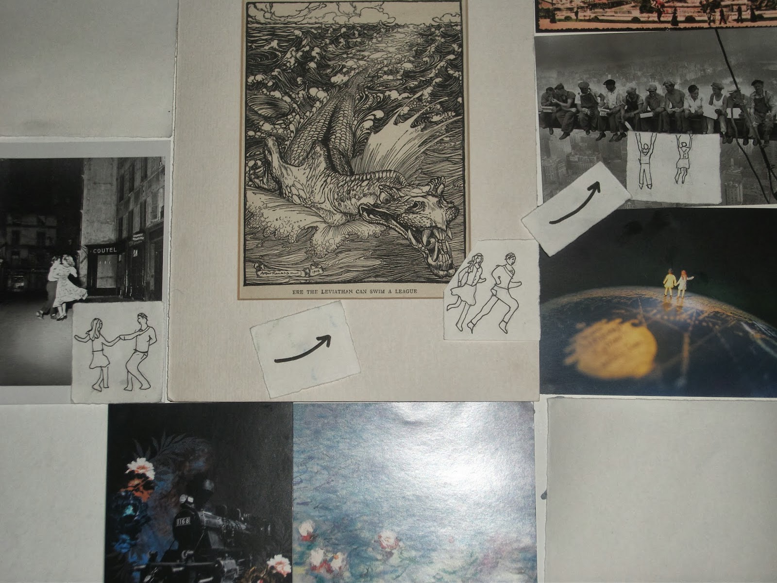
In my new story, two postcards, pictures of  a lonely boy and girl, come to life at midnight and meet each other. They explore the other pictures on the wall. Dancing in Paris on Bastille day, being chased by a leviathan, and swinging from the girders in 'Lunchtime atop a Skyscraper' they start to fall in love. However, as the hour comes to and end they prepare to part as they know they have to under the Eiffel Tower. As one o'clock is seconds away they run to try and make it back to their pictures in time. The final image of the storyboard shows that the two managed to stay together and so they remain. I brought in the idea of moving through the other pictures which I scrapped in the previous storyboard as it proved popular with my peers. Despite going through a lot of ideas before reaching this one I picked this as it had the happiest ending. I enjoyed this project a lot overall though would have liked to work with a larger range, perhaps getting a chance to stop-motion animate my storyboard so as to develop the characters' emotions and struggles further.