Following our introductory lessons, the design and media foundation students who had opted for the fashion and textiles pathway were merged into a new class with the fashion foundation students. Our first project was to be a group one (probably for bonding purposes). For this project we were assigned a designer and a group and told to create a campaign and concept for a collection, with each of us undertaking different roles as they would be carried out in the industry. There were six of us in my group (smaller than most of the others) with peers that I had never met before. Within the group I was in charge of menswear design for the range, there was also a womenswear designer, a print designer, an accessory designer, and two promoters (whose job it was to create campaign posters/films, design the catwalk etc). The designer we were assigned (for whom we would hypothetically be creating a campaign, and so would mimick the style of) was J.W. Anderson.

J.W. Anderson:
J.W. Anderson graduated in menswear at the London College of Fashion in 2005. His label was launched in 2008. Anderson in acclaimed for exploring the relationship between genders and blurs the lines with an androgynous style in all of his collections. He won the Emerging Talent Award for British Fashion in 2012.
After being assigned our designer and various roles we were given a quotation, which we could interpret ourselves and use as a premise and theme for our collection.
'All that is solid melts into air, all that is holy is profaned, and man is at last compelled to face with sober senses his real conditions of life, and his relations with his fellow men.' -The Communist Manifesto
As a group we discussed this, and decided to focus on the last section, about the real conditions of life and man's relationship with his fellow men. This made us think of conflict and war, and we discussed this further, thinking how it could fit well with J.W. Anderson's usual styles since gender roles are challenged in wartime. When women contributed to the World War efforts it was perhaps the first time typical patriarchal systems were changed significantly, and this blurring of gender roles was something we thought we could translate well in a wartime theme within J.W. Anderson's label. After agreeing on this overarching theme as a group we designed a logo for the collection and put together a mood board with a colour scheme.
 |
| LOGO |
 |
| Group Mood Board |
Then we discussed what we planned to do individually, as although we would be presenting the work as a team and would be assessed based on how cohesive our work was, we each needed our own outcomes and work for grading and our blogs. Therefore, once we had done our initial planning we broke off to work individually within our roles. I had expressed a preference to be the menswear designer for our group as menswear design is something I had never done before, and so I wanted to challenge myself and explore new ideas. I also like the androgynous style of J.W Anderson's menswear collections so thought it a good place to start. Therefore, as I gathered my own images for reference, I looked at J.W. Anderson's previous collections and military inspired fashion from both men and women for inspiration.

With the concept and initial ideas in mind, I started doing quick, rough designs in my sketchbook, doing ten or so jackets, ten trousers, ten shirts etc. From these I developed and picked out several outfits, trying different combinations for looks, eventually coming up with ten design ideas (see below):
 |
| Rough Designs and Fabric Swatches |
 |
| Ten Design Ideas |
.jpg) |
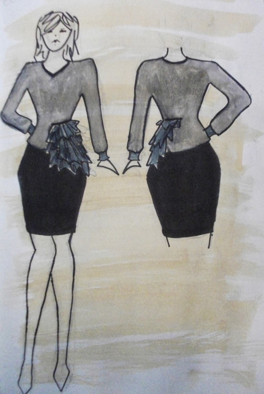
| Final Design 1 |
 |
| Final Design 2 |
 |
| Final Design 3 |
 |
| Final Design 4 |
 |
| Final Design 5 |
Final Designs:
After finishing my ten design ideas I presented them to the group and they picked out their five favourites for me to colour. We did the same with the womenswear designer's ideas so for the final presentations we had a collection of ten looks that could work together in a campaign. With my final designs picked out for me, I added colour, keeping to the scheme we had decided on at the beginning of the project. Another idea we had, to bring together the collection, was to add a little bit of red into the palette of conventional military khakis and dark greys, with one piece being entirely red. We felt this was appropriate for the theme. Therefore, in some of my designs, such as designs one or four, there are only very subtle hints of red: the lining of a pocket etc. I am reasonably happy with my final collection, however feel I could have explored and developed the concepts of the theme more.
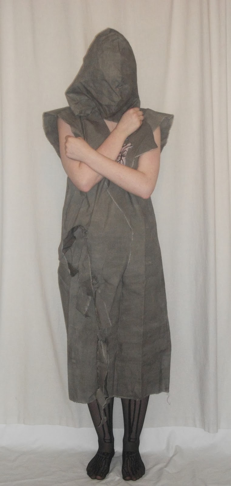
The group also asked me to model for campaign posters and a video for the promotion side of the campaign. As we couldn't model the clothes we were designing, the concept was more about capturing the mood and theme of the work. We looked back at the quotation for reference, and thought again about the idea of man's 'relations with his fellow men'. We decided that although we would have undercurrents of the war theme, the collection was just as much about human interaction and relationships on other levels, which we could show by having more than one model for promotion.
 |
| Promotional Posters |
 |
| Promotional Poster/Advertising Campaign |
Overall, I found this project quite difficult as I felt working with people I had never met before added pressure. Worrying that your work was up to everyone's standard added stress and made it difficult for me to design freely. Also, trying to change your work to make it compatible and cohesive with others was challenging. Therefore, although I enjoyed trying menswear design for the first time, working in groups meant I had less creative freedom to experiment with my own style. As a group the project worked out fine and the final presentation went well, yet personally I felt I hadn't explored the project and possibilities in enough detail before putting together my final designs. I recognise the importance learning how to collaborate on projects for industry and practical reasons however, I think I work better individually.